Linen, Cotton or Wool: Reading a Curtain by Its Weave
Linen, cotton or wool curtains: learn to read weave, texture and drape so you can choose a fabric that suits the window and the room’s atmosphere.
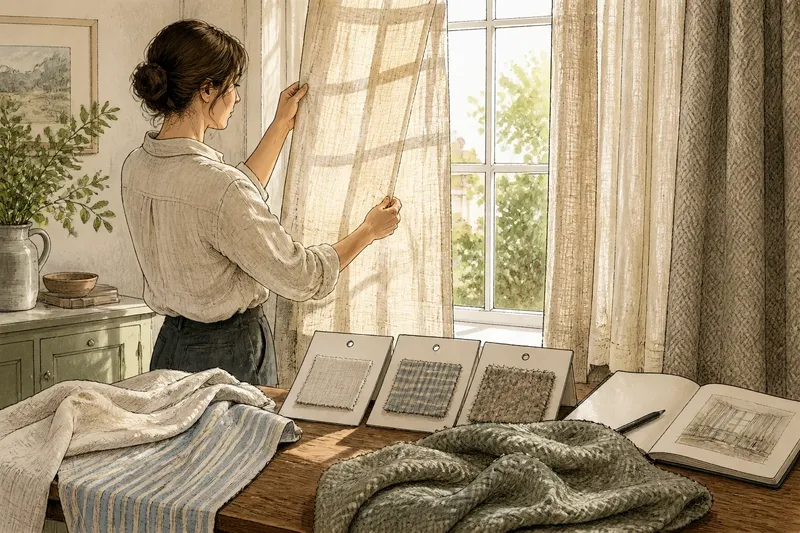
Hold a curtain sample against the window and its weave becomes easier to read: open threads admit light differently from a dense, softly brushed surface. Linen, cotton or wool curtains can each suit a room, but the fibre name alone will not tell you how the finished panel hangs. Look closely at texture and drape, then consider the mood those qualities create at the window.
1. What does the weave reveal before you choose a fibre?
Start by looking through the cloth towards a light source. A loose weave has visible gaps between yarns; a compact one looks more continuous. This gives you a first impression of how much the fabric may filter the view, though colour, lining and the way a panel is gathered also affect the result.
Next, inspect the surface. Linen commonly shows irregular slubs: small thick places that give the thread a lively, uneven character. Cotton can be woven smooth and neat or textured into a pronounced pattern. Wool often has a fuller, softer-looking surface, although its finish varies considerably. These are clues, not rules; blends and finishing treatments can alter the appearance.
Check the reverse as well as the front. A fabric that looks crisp from the room may have a softer reverse, or a patterned weave may show its structure on both sides. If the curtain will be visible from outdoors, that difference may matter. Ask for a hanging sample where possible, since a small flat swatch conceals the folds that reveal a fabric’s character.
2. How does linen shape the window?
Linen is often chosen for its visible yarn variation and relaxed, slightly dry-looking surface. Its slubs catch the eye without requiring a bold print, so a plain linen curtain can still give a window texture. In a quiet room, that subtle irregularity can make a large expanse of fabric feel less blank.
Its drape tends to look more defined than plush: folds may fall in clear lines, with a casual crease rather than a perfectly smooth face. The precise effect depends on the weave and weight. A lighter linen can look airy; a denser one may form broader, more substantial folds. The label and the hanging sample are better guides than the word “linen” by itself.
Choose linen when you want the window to feel natural, calm or gently informal, and when visible texture is welcome. It can work with painted walls, timber and simple furnishings, but it need not be confined to rustic interiors. Pair a refined, fine-weave linen with precise hardware and tailored edges for a more composed effect.
3. What can cotton do that linen cannot?
Cotton is a flexible starting point because it can be woven in many ways. A smooth, close weave gives a tidy, straightforward appearance; a slubbed or basket-like weave adds depth. Printed cotton can introduce pattern while retaining a relatively familiar, matte surface. So, read the cloth rather than assuming every cotton curtain has the same look.
In a light weave, cotton may form easy folds and keep the window from feeling too formal. A heavier or more structured cotton can look crisp and hold a more deliberate shape. This makes it useful when you want a plain fabric that can appear either relaxed or neat, depending on its construction and heading.
Cotton often suits rooms where you want a clear colour or pattern without making the textile’s texture the main event. Consider it for a bedroom, workroom or sitting room where the curtain needs to relate to other fabrics. If you are matching an existing cushion or rug, take the actual item to compare: a screen can disguise differences in colour and surface.
4. When does wool make sense at a window?
Wool usually reads as fuller and more tactile than a fine, smooth cloth. Its surface may look softly matte, felted or visibly woven, depending on the yarn and finish. A wool curtain can lend a room a settled, enveloping atmosphere, particularly when its folds are broad enough to show the fabric’s body.
That visual weight is part of its appeal, but it also changes the balance of a window. In a small room or beside delicate trim, a thick fabric may dominate; a lighter wool blend or a restrained colour may feel more at ease. Conversely, a large bare window can benefit from the visual substance of a substantial weave.
Imagine you are choosing curtains for a quiet reading room with pale walls and a broad window. A smooth cotton sample might preserve a clean, understated look; a slubbed linen could add a looser, more organic note; a softly textured wool could make the window feel more enclosed. Compare all three in the room’s daylight, then decide which atmosphere belongs with the furniture and finishes already there.
5. Which questions help you compare curtain fabrics?
How can I tell whether a curtain will look sheer?
Hold the sample against daylight and look for visible gaps, then view it against a darker background. A swatch gives a useful indication, but the finished panel’s lining, fullness and folds will change the effect.
Does a heavier-looking weave always hang better?
No: “better” depends on the shape you want. A crisp, lighter fabric may suit narrow folds, while a fuller cloth may create a more substantial frame; check a hanging sample rather than judging weight by appearance alone.
Can linen, cotton and wool be blended?
Yes, curtain cloth may combine fibres, and the blend can change its surface and drape. Read the fibre label and inspect the fabric itself, since the proportions and construction matter to the result.
Should I choose the fabric before the curtain heading?
Consider them together. A gathered heading, pencil pleat or eyelet arrangement presents the cloth in different folds, so ask to see how your preferred fabric behaves with the heading you plan to use.
6. How do colour and finish change the reading?
Texture is easier to judge in a colour close to the one you intend to buy. Pale cloth can make slubs and weave gaps conspicuous in daylight; dark cloth may make the same structure appear quieter. A sheen can also compete with the weave, while a matte finish tends to keep attention on the yarns and folds.
Look at the sample beside the wall colour, window frame and nearby upholstery. Compare it in daylight and under the room’s usual lamps, since a warm interior light can shift how a neutral fabric reads. If the room already has patterned cushions or a textured rug, a calmer curtain may let those details remain legible. Where the room is visually plain, a more pronounced weave can supply interest without adding another motif.
7. How should you make the final choice?
Choose the fabric by the effect you want at the window, not by a ranking of fibres. Linen often offers visible irregularity and an easy, relaxed character; cotton spans smooth, patterned and textured looks; wool can bring a fuller, softer presence. Each description is a starting point, not a promise about every cloth sold under that fibre name.
- Check the weave against daylight to judge its apparent openness.
- Handle the surface and compare its texture with nearby furnishings.
- Ask to see the fabric hanging so its folds are visible.
- Compare the colour beside the wall, frame and upholstery.
- Read the fibre and care labels before deciding how the curtain fits your household.
- View the sample in the room’s ordinary daylight and evening light.
For linen, cotton or wool curtains, the most useful choice is the cloth whose texture, drape and atmosphere feel right in your particular room. If cleaning or care affects the decision, follow the fabric label and manufacturer’s instructions. A small hanging sample can settle the visual question more clearly than a fibre name ever will.